
The modern world is increasingly guided by data and data driven decisions. New information is continuously being mined for the sake of inference and understanding. However, data can be misrepresented and/or easily misunderstood. Data visualization tools like graphs, plots, animations, etc. are an essential way to represent and convey spreadsheets full of monotonous data. Turning a data set into a boiled down version of itself can be misleading at times. We have compiled a shortlist of some of the most common mistakes we see in data visualization, including sometimes intentional tactics to mislead the viewer. Our hope is to help you better understand some common data visualization problems.
The Obvious Offender
We’ve all heard of it. “The axis is broken”. This example of data misrepresentation is the quintessential version of how data visualization can be misleading. Sometime this visual approach is well-warranted but in other circumstances it is can be used maliciously to sway the viewer. The main takeaway of this type of data visualization trickery is that the axis of a graph shows the relative magnitude of the data and can be manipulated as such. Take, for example, the two graphs below from callingbullshit.org:
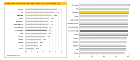
One could react to the first graph with the conclusions that Romania and the UK are diligently hard at work, while Italy and France are the laziest in the EU. And judging by the relative magnitudes of this bar graph, someone may even falsely infer that Romanian’s work 4 times that of the French. However, this is obviously untrue and the nature of the misinformation is that the axis of the left graph starts on 36 hours. The graph on the right is a more accurate representation of the relative differences and shows the exact same data but is less misleading (and arguably far less visually interesting)
Pie Charts Are Not So Sweet
While pie charts are fantastic data visualization tools for showing relative representation of a greater whole, they should generally be avoided when comparing data changes between events or comparing relatively close samples.
As it turns out, humans are bad at reading angles, especially detecting small changes between two different angles. The image below (from data-to-viz.com) may look like three identical pie graphs but upon a closer inspection they are actually all slightly different . For the sake of explanation, each pie chart represents a comparison of data samples (single pie chart) taken at different time intervals (each pie chart represents a different day, per say).
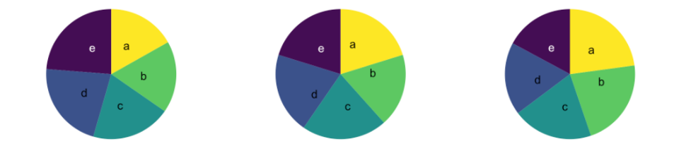
Now, see the bar graph below that is a different visual representation of the exact same data set.
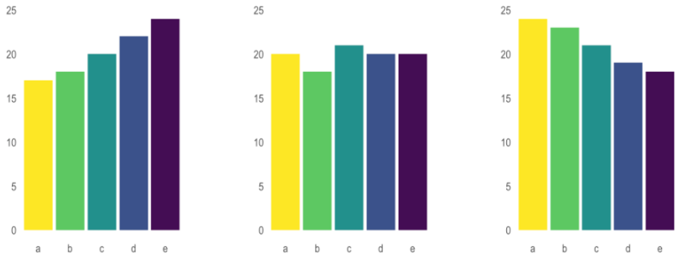
In the bar graph plots, not only is the comparison data between samples more evident, but the change between the same samples at different intervals is significantly more apparent. While the argument could be made that labeling the data on the pie chart could alleviate some of the confusion between the different charts, that is beyond the point of the argument. The argument is that there are significantly better ways of plotting comparative or time series data that can paint a more clear and concise visual representation than a pie chart.
Data Resolution
While plotting data against time is critical for understanding trends, time intervals can often be misrepresented. Condensing non-constant parameters into easily digested sections can negatively influence your data visualization and can result in a negative bias of oversimplification.
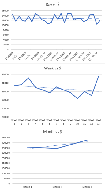
A wonderful example is plotting accounting metrics in ‘months’ rather than weeks (where every third month is often considered a 5 week month at either the beginning or end of a fiscal quarter. Doing so can overvalue certain datapoints when higher resolution of your axis can show completely different data trends.
The below image shows data plotted from the exact same source set, whereby the resolution of the x-axis is varied. There are three different magnitudes of growth (slope of trendline), which could drastically impact forecast metrics when looked at on a micro-scale given that “Month 3” is the 5-week month. When plotted day-by-day, no growth in the randomized data set is found. When plotted week-by-week, the data set shows a negative trend even though the ending week is the highest recorded. And when plotted month-by-month the trendline shows growth, albeit this is unsurprising given Month 3’s extra weight
This trend is loosely related to Simpsons paradox, which is when a trend appears in different subsets of data but disappears or reverses when the groups are combined. With any large trend-showing data sets, be sure to always look at the data within different or larger groups to avoid misrepresentation of the data trends.
These are just a few of our “pet peeve” data visualization challenges. Please let us know your favorite misleading graphs and charts. We’d love to see them! Email us at sales@NimbleGravity.com.
.png?width=360&height=240&name=email%20sign%20up%20graphic(2).png)